
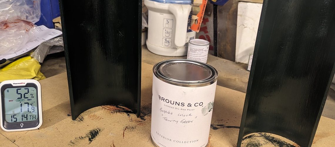
Black is the colour most people reach for when cast iron gutters and downpipes are repainted, yet on many period houses it is neither the original colour nor the most flattering one. This guide sets out what the evidence says about historic ironwork colours, walks through the Georgian, Regency, Victorian, Edwardian and Arts and Crafts palettes, and matches each period to specific colours from our linseed oil paint chart so that owners, architects and conservation officers can choose with confidence.
Technical Summary: Cast iron gutters, downpipes and hopper heads were historically painted in a wide range of colours: lead greys, stone whites, invisible and bronze greens, oxide reds and browns, with black one option among many. Black as a near-universal default is largely a twentieth-century convention. For Georgian and Regency houses, stone whites, off-whites and lead greys are usually the most authentic choices; for Victorian buildings, deep greens, browns and a cool grey-black; for Edwardian houses, lighter whites and greens; and for Arts and Crafts buildings, olives, mosses and soft greys. Our linseed oil paint range offers 38 historically accurate colours in seven families, factory-applied in our Mid Wales workshop as two coats of linseed red oxide primer and three topcoats. A linseed oil finish adds 6 to 7 weeks to any order. Sample swatches are available on request.
Choosing a colour for cast iron rainwater goods is one of the few decisions on a period house that is easy to get wrong and tiresome to live with. Gutters and downpipes run the full height of the building and frame every elevation. The colour they are painted either settles them into the facade or turns them into a set of dark lines drawn across it.
The most authentic colour for cast iron gutters is rarely a default black: on most Georgian, Regency, Victorian, Edwardian and Arts and Crafts buildings the historic choice was a stone white, lead grey, green, brown or oxide red selected to suit the walls behind it. Black has its place, particularly on formal Georgian and Regency terraces, but it became the universal answer only in the twentieth century, when repainting contracts, ready-mixed tins and a general loss of colour knowledge made it the path of least resistance.
This article is written first for the owners of listed and period houses, and then for the architects, surveyors and conservation officers who advise them. It explains where the evidence for historic colours comes from, gives a period-by-period guide with specific colours from our linseed oil paint chart, and sets out how to make the decision on a real building: reading the masonry, testing sample panels, and knowing when a change of colour needs Listed Building Consent. It does not repeat the full colour chart or the application method. Both are covered elsewhere on this site and are linked where relevant.
Black became the standard colour for cast iron rainwater goods during the twentieth century, not because it was historically correct but because it was convenient. Before then, ironwork on houses was painted in whatever colour suited the elevation, and black was one choice among several.
Three things drove the shift. The first was paint supply. Until the mid-nineteenth century, exterior paint was mixed by the painter from pigment, linseed oil and driers, and the trade price books of the period list lead colour, stone colour, invisible green and chocolate as standard finishes for exterior ironwork alongside black. From the 1860s onward, ready-mixed paint in tins made it possible for a contractor to buy a single black for railings, gates, gutters and downpipes, and the carbon blacks it was made from were inexpensive, opaque and forgiving of poor preparation.
The second was the arrival of coatings sold specifically for iron. Berlin black, a hard-drying black japan, was marketed for stoves and ironwork through the Victorian period, and from the interwar years bituminous paints became the routine treatment for rainwater goods on estates, council housing and institutional buildings. Both were black by nature rather than by design, and both were applied over whatever colour had been there before.
The third was habit. Once a terrace has been repainted black two or three times, the black becomes the remembered colour, and the older greys and greens beneath it are forgotten. The story that London’s railings were painted black in mourning for Prince Albert after 1861 is repeated often but has no documentary basis; architectural paint research shows that the move to black was gradual, city-led and largely complete only in the twentieth century. None of this makes black wrong. Two of the 38 colours on our chart are blacks, and they are there for good reason. The point is that black is a choice to be made on the evidence, not a rule to be inherited from the last repaint.
The evidence for historic ironwork colours comes from three sources: paint layers surviving on the ironwork itself, documentary records such as painters’ price books, estate accounts and specifications, and the physical logic of the pigments available in each period. Together they give a clear and consistent picture.
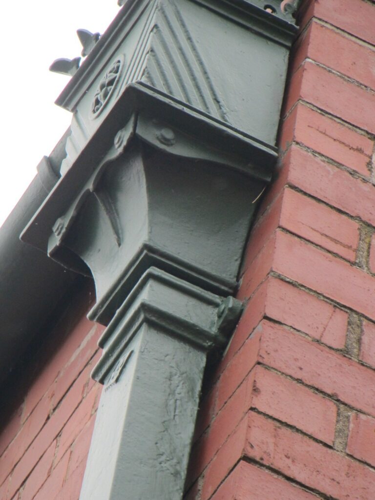
Architectural paint research takes a small sample through every paint layer on a downpipe, hopper or bracket and examines it in cross-section under magnification. On rainwater goods that have never been stripped, a dozen or more schemes can survive beneath the black. Historic England treats paint analysis as the starting point for redecoration on buildings of significance, and the standards set out in Layers of Understanding: Setting Standards for Architectural Paint Research (English Heritage, 2002) remain the professional benchmark.
The most revealing samples on rainwater goods come from sheltered places: behind a downpipe where it passes a string course, under the flange of a hopper head, inside a gutter socket, or on the back of a bracket. Early layers survive there when the exposed faces have been scraped and burnt off. For that reason we recommend that original sections being replaced are kept until they have been examined. A new casting carries no evidence; the old one does.
Eighteenth-century price books list lead colour, a mid grey made from white lead and a little lamp black, as a standard finish for exterior ironwork and joinery. On Georgian town houses it was used on railings, gates and the cast iron rainwater goods that began to replace lead pipes and heads from the later eighteenth century. The intention was continuity: iron that replaced lead was painted to look like lead, so that the elevation read exactly as it had before.
Old Lead No.36, formulated to replicate aged lead rainwater goods, and Green Grey No.12, which carries the slight green cast of weathered lead and slate, serve the same purpose on our chart today and are the colours most often accepted by conservation officers where cast iron replaces lead on a listed building.
Much historic ironwork was painted to disappear. Stone-coloured paint on iron against stone or stucco, and invisible green, the dark grey-green that Humphry Repton and his contemporaries recommended for garden railings so that they receded against foliage, show the same instinct at work. Rainwater goods were plumbing, not ornament, and the colour was chosen so that the eye passed over them. The exceptions were the ornamental pieces: dated, armorial or moulded hopper heads and decorative brackets were occasionally picked out in a darker or richer colour than the pipe they served.
Green is the most under-used historic colour on ironwork today. Two families dominated the nineteenth century. Bronze green was a dark olive intended to imitate weathered bronze; it appears on railings, lamp standards and rainwater goods from the Regency onward and became the standard municipal ironwork colour of many Victorian towns. Brunswick green was a chrome-based pigment, chrome yellow combined with Prussian blue, that gave the deep, slightly blue-toned green of Victorian railway companies, public buildings and estate ironwork. Olive No.16, Amsterdam Green No.20, Highfield Green No.21 and Map Green No.24 all sit within this tradition.
Iron oxide has been used as an anti-corrosion pigment for centuries, and on farm buildings, mills, warehouses and estate outbuildings the red oxide primer was often simply left as the finish or topped with a barn red or deep brown from the same earth-pigment family. Dark Iron Oxide Red No.31, Barn Red No.32 and Brodsworth Brown No.33 belong to this working tradition, and the estate practice of painting every gate, railing, door and downpipe in a single livery colour was as much about maintenance as appearance: one tin, one colour, one repainting cycle.
Regency stucco was routinely painted stone colour in oil to imitate Bath or Portland stone, and the ironwork on such facades was often painted to match, or in a slightly darker stone tone so that it read as a shadow line rather than a separate material. Whites and creams were also used on the rendered and colour-washed brick of Georgian market towns. Project White No.1, Cambridge No 7 No.2, Whiteley No.5, Warm Grey No.6 and Pearl Grey No.7 cover this ground on our chart.
Our linseed oil range comprises 38 historically accurate colours in seven families, applied to the castings in our Mid Wales workshop before despatch. Colours outside the range can be produced to order, including exact matches from an existing sample, subject to a minimum quantity. The full chart, with a swatch and a description of every colour, is on our paints and finishes gallery and in our earlier article on traditional linseed oil paint colours; this article does not repeat it. The table below is a map of the families and the periods they serve best.
| Colour family | Colours in the family | Where it belongs |
|---|---|---|
| Whites & Creams (7) | Project White No.1, Cambridge No 7 No.2, Restoration White No.3, Warwick’s Bench No.4, Whiteley No.5, Clotted Cream No.10, Fairburn No.13 | Georgian and Victorian town houses, stucco and render, university and institutional buildings, limestone districts |
| Greys & Stones (9) | Warm Grey No.6, Pearl Grey No.7, Quartz No.9, Haddon Estate Grey No.11, Green Grey No.12, Highfield Grey No.14, Medway, PA No.15, Silver Grey No.25, Old Lead No.36 | Stone-built and stucco Georgian and Regency buildings; Listed Building Consent applications where cast iron replaces lead; Victorian municipal and ecclesiastical ironwork |
| Greens (7) | Olive No.16, Moss No.17, Echo No.18, Leaf Green No.19, Amsterdam Green No.20, Highfield Green No.21, Map Green No.24 | Victorian and Edwardian buildings, estate and walled-garden ironwork, Gothic Revival, civic and institutional architecture, Arts and Crafts houses |
| Blues (4) | Ice Blue No.22, Mountain Blue No.26, Chatsworth Blue No.27, Maastricht Blue No.28 | Regency coastal buildings, formal country houses, ecclesiastical settings, buildings with a Scandinavian or Baltic influence |
| Yellows & Ochres (3) | Arran No.23, Sand Yellow No.29, Golden Yellow No.30 | Sandstone, granite and golden limestone settings; rural estate and industrial heritage buildings |
| Reds & Browns (5) | Dark Iron Oxide Red No.31, Barn Red No.32, Brodsworth Brown No.33, Italian Umber No.34, Manderley No.35 | Farm and estate buildings, industrial heritage, Victorian and Edwardian estate liveries, feature hoppers and brackets |
| Blacks (2) | Cast Iron No.37, Blackout No.38 | Formal Georgian and Regency terraces, monochrome listed schemes, Victorian urban buildings where black is evidenced |
The period of the building is the best starting point for colour, because each period had its own palette of pigments, its own wall materials and its own view on whether ironwork should show or disappear. The sections below give the historic palette for each period, the walls it was usually set against, and the closest colours on our chart. Treat the recommendations as a shortlist for sample panels rather than a prescription; the building itself has the final say.
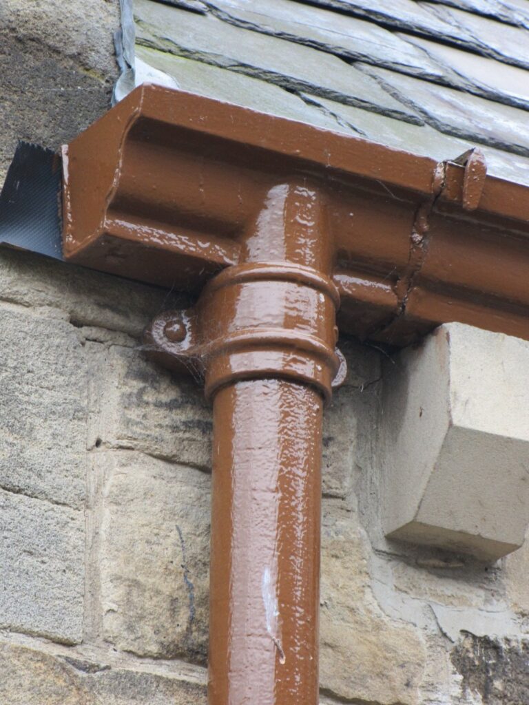
The Georgian and Regency palette for ironwork was quiet: lead colour, stone colour and off-whites that let the iron read as part of the masonry, with invisible green on garden and area railings. Black appears on formal town terraces, particularly in the later Regency, and there is a genuine tradition of black on Georgian railings, balconies and the great terraces of London, Bath, Bristol, Edinburgh and Dublin, so a black scheme on such a building is defensible where the evidence supports it. On the ordinary Georgian house, though, the rainwater goods were more often painted to recede.
Typical walls: London stock brick, red rubbed brick with tuck pointing, Bath and Portland stone, painted stucco, colour-washed render in market towns. Our recommendations:
The Victorian palette for ironwork was rich and dark: bronze and Brunswick greens, chocolate and umber browns, deep greys and, increasingly in cities and on Gothic Revival buildings, black. Estate architecture kept its livery greens and browns; municipal buildings, schools and railway architecture favoured green; and the black that does appear on Victorian ironwork is a cool, slightly grey black rather than the blue-black of a modern tin.
Typical walls: red and polychrome brick, terracotta, coursed and rock-faced stone, Welsh slate roofs. Our recommendations:
The Edwardian palette lightened. White and cream joinery against red brick became the convention, greens moved towards mid and leaf tones, and greys took on a softer, stone-like quality. The Queen Anne Revival and Domestic Revival houses of the period combine red brick, roughcast upper storeys, tile-hanging and white-painted timber, and their rainwater goods were usually painted to sit with the joinery rather than the brick. On the grander Edwardian Baroque civic buildings, greens and greys on ironwork carried the same institutional authority as they had in the 1880s.
Typical walls: red brick, terracotta, roughcast and pebbledash, tile-hanging, white-painted timber. Our recommendations:
Arts and Crafts architects wanted materials to look like what they were, and ironwork was no exception. Rainwater goods were painted in olives, mosses, soft greys and dark browns that sat with oak framing, roughcast render and local stone, and colour was chosen to belong to the landscape rather than to advertise the plumbing. The white roughcast houses of C. F. A. Voysey and his followers, with their green-painted ironwork and joinery, are the best-known expression of the palette, but the same instinct runs through the movement’s stone and brick houses too.
Typical walls: white or cream roughcast, lime render and limewash, exposed oak framing, hand-made brick, local rubble stone, tile-hanging. Our recommendations:
Estate ironwork was painted in a livery: one colour across gates, railings, doors, windows and rainwater goods, chosen by the estate and repeated for generations. Greens and browns were the commonest liveries, oxide red was standard on farm buildings, and a few great estates adopted a blue. Moss No.17 and Highfield Green No.21 cover the green liveries, Brodsworth Brown No.33 the browns, Barn Red No.32 and Dark Iron Oxide Red No.31 the agricultural reds, and Chatsworth Blue No.27 the formal estate blue. On sandstone and granite estates, Sand Yellow No.29 and Arran No.23 give a warmer, earthier tone than a grey can. Our heritage specification guide for estate buildings and walled gardens sets out the rest of the specification.
Mills, warehouses, engine houses, maltings and railway buildings were painted for protection first and appearance second. Dark Iron Oxide Red No.31, the classic primer red of cast iron conservation, doubles as a finished coat and is the most authentic choice on many industrial buildings. Highfield Grey No.14 suits heavy ironwork on stone-built mills, Barn Red No.32 works on brick, and Golden Yellow No.30 is a declarative ochre with a genuine history on industrial and rural estate buildings for those with the confidence to use it. Cast Iron No.37 is right where the evidence points to black.
On Regency seaside stucco, the whites, Pearl Grey No.7 and Ice Blue No.22 belong to the period; on stone-built harbour towns, Silver Grey No.25, Green Grey No.12 and the deep greens sit well against slate and granite. Colour also affects maintenance in salt air: pale colours show salt staining less, dark colours show chalking sooner, and every colour lasts longer with an annual wash. Our article on linseed oil paint for cast iron in salt-air environments deals with the coastal specification in full.
| Period | Typical historic colours | Recommended chart colours | Typical wall materials |
|---|---|---|---|
| Georgian & Regency | Lead colour, stone colour, off-white, invisible green; black on formal terraces | Old Lead No.36, Green Grey No.12, Warm Grey No.6, Pearl Grey No.7, Quartz No.9, Cambridge No 7 No.2, Project White No.1, Whiteley No.5, Ice Blue No.22 (coastal), Blackout No.38 (formal terraces) | Stock and rubbed brick, Bath and Portland stone, painted stucco, colour-washed render |
| Victorian | Bronze green, Brunswick green, chocolate and umber browns, dark greys, cool black | Amsterdam Green No.20, Olive No.16, Highfield Green No.21, Leaf Green No.19, Map Green No.24, Brodsworth Brown No.33, Italian Umber No.34, Haddon Estate Grey No.11, Highfield Grey No.14, Cast Iron No.37 | Red and polychrome brick, terracotta, coursed and rock-faced stone, Welsh slate |
| Edwardian | White and cream with red brick, mid and leaf greens, soft stone greys | Restoration White No.3, Fairburn No.13, Leaf Green No.19, Echo No.18, Moss No.17, Medway, PA No.15, Map Green No.24 | Red brick, terracotta, roughcast, pebbledash, tile-hanging, white-painted timber |
| Arts and Crafts | Olive and moss greens, grey-greens, weathered-lead greys, dark browns | Olive No.16, Moss No.17, Echo No.18, Green Grey No.12, Highfield Grey No.14, Silver Grey No.25, Warwick’s Bench No.4, Brodsworth Brown No.33, Manderley No.35 | White roughcast, lime render and limewash, oak framing, hand-made brick, local rubble stone |
| Rural & estate | Estate livery greens and browns, oxide and barn reds, occasional estate blue | Moss No.17, Highfield Green No.21, Brodsworth Brown No.33, Barn Red No.32, Dark Iron Oxide Red No.31, Chatsworth Blue No.27, Sand Yellow No.29, Arran No.23 | Rubble stone, sandstone, granite, brick, timber-clad and weatherboarded outbuildings |
| Industrial | Red oxide, dark grey, black, occasional ochre | Dark Iron Oxide Red No.31, Highfield Grey No.14, Barn Red No.32, Golden Yellow No.30, Cast Iron No.37 | Engineering brick, coursed stone, cast iron and timber framing |
| Coastal | Stone whites, pale greys and blues on stucco; greys and deep greens on stone harbours | Pearl Grey No.7, Ice Blue No.22, Project White No.1, Silver Grey No.25, Green Grey No.12, Amsterdam Green No.20 | Painted stucco, rendered and limewashed rubble, granite and slate |
Choose the colour by deciding first whether the rainwater goods should recede into the walls or read as a deliberate line, and then by testing the shortlisted colours on the building itself. On most period houses the historic answer is to recede, and the colour that achieves it is usually one already present somewhere on the elevation.
Matching is the older instinct. On stone, stucco, lime render and painted brick, a grey, stone or off-white within a shade or two of the wall makes the gutters and downpipes part of the surface, and the profile of the cast iron gutter reads as a moulding rather than a pipe. Warm Grey No.6 on Bath stone, Quartz No.9 on grey limestone, Cambridge No 7 No.2 on white render and Old Lead No.36 on almost any pale masonry are the workhorses of this approach.
Contrast is the Victorian and Edwardian instinct, and it belongs on brick. Red brick takes a deep green or a cool black without either looking harsh, polychrome brick is calmed by a single dark green, and white roughcast takes olive or moss as its natural companion. The rule that holds across every period is that the gutter colour should relate to something already on the building, whether the joinery, the roof slate, the stone dressings or the railings, rather than introducing a new colour of its own.
Before choosing, walk round the building with a notebook and record the following. Each item narrows the shortlist.
Sample swatches are available on request, but a swatch in the hand is not the colour on the wall. Paint a short offcut of downpipe or a test panel in each shortlisted colour and view it against the actual elevation in morning and evening light, wet and dry. Colours look darker over a large area than on a swatch, lighter in strong sun and cooler in shade. Linseed oil paint has a soft sheen when first applied that settles to a matt surface over the first months of weathering, and the colour deepens very slightly as the oil cures, so judge the panel after a few weeks where the programme allows. Our step-by-step application guide explains how to prepare and paint a test piece correctly.
Conservation officers expect a colour choice on a listed building to be evidence-based and consistent. Where the existing colour is historic, they will normally expect it to be retained; where black is a modern overpaint and an earlier colour is documented, a return to that colour is generally welcomed; and where cast iron is replacing lead, Old Lead No.36 is the colour most often accepted. On a terrace or a planned group, consistency along the row will be expected, and on a building of high significance a paint research report may be requested before any change is agreed. A sample panel on site, viewed with the officer, resolves most questions quickly. The same expectations apply under Cadw in Wales, Historic Environment Scotland, the Historic Environment Division in Northern Ireland and the Record of Protected Structures in the Republic of Ireland.
Repainting cast iron rainwater goods in their existing colour is maintenance and does not need Listed Building Consent. Changing the colour on a listed building can need consent, because under the Planning (Listed Buildings and Conservation Areas) Act 1990 any work that affects the building’s character as a building of special interest requires it, and a change of colour on external ironwork can meet that test. Practice varies between authorities: some treat a change of paint colour on rainwater goods as de minimis, others as requiring consent, and in conservation areas an Article 4 direction can remove permitted development rights for painting. Ask the conservation officer in writing before ordering, and where new cast iron is being installed under an existing consent, name the chart colour in the application or discharge-of-conditions submission so that the colour is agreed before the castings are painted. Our guide to what needs Listed Building Consent and our listed buildings FAQ cover the wider consent position.
Where the right colour is not one of the 38 on the chart, we can match a colour to order from an existing sample, subject to a minimum quantity. A physical reference is essential: a paint flake, a section of the original ironwork, a swatch from a paint research report or a British Standard or RAL reference all work, but a photograph does not, because screens and cameras do not reproduce colour reliably. Send the reference with the order, keep a piece for site comparison, and allow the same 6 to 7 weeks for the finish as for a chart colour. Our page on paint specifications and bespoke colours sets out the other factory finishes we offer alongside linseed oil.
Historic oil paints dried to a soft sheen and weathered to a matt, slightly chalky surface within a season or two, so a modern high-gloss finish is visually out of period on most historic ironwork however correct the colour. Linseed oil paint reproduces the historic surface as well as the historic colour, which is why the two decisions belong together.
Sheen changes how a colour reads. A gloss surface reflects the sky, which lightens and cools the colour, breaks it into highlights and makes a downpipe look like a glazed rod fixed to the wall. A matt or eggshell surface shows the true pigment, holds the colour evenly from top to bottom of the elevation and lets the form of the casting, the bead of a half-round gutter, the mouldings of an ogee, the ornament of a hopper head, read through it. That is why the same green looks right in linseed oil and wrong in a modern gloss enamel.
There is a caveat. Some Georgian and Regency railings and balconies were finished to a higher sheen, and a black gloss on formal ironwork of that kind is a long-standing convention that need not be disturbed. For rainwater goods, which were painted as plumbing rather than ornament, the low-sheen finish is the more accurate one across every period. Our article on matte and non-glossy paint finishes for historic buildings explains the visual case in detail, and our complete specification guide to linseed oil paint covers the breathability, flexibility and long-term behaviour of the coating on cast iron.
We apply the linseed oil finish in our own workshop in Mid Wales before despatch. The castings are prepared by wire brush or shot blast and degreased, then given two coats of pure linseed red oxide primer and three topcoats for outdoor installations. Each coat is allowed to dry for 48 to 72 hours depending on temperature and light, and every coat is applied by natural bristle brush, so the finish carries the light brush texture that is characteristic of traditional oil paint. A linseed oil finish adds 6 to 7 weeks to any order.
Lead times are additive. Stock items are available in 5 to 7 working days and non-stock standard profiles in 7 to 10 working days; bespoke and copy cast items take 12 to 14 weeks from pattern approval. Add the linseed oil finish to each: a stocked half-round system in Amsterdam Green No.20 is therefore typically around 7 to 8 weeks from order, and a copy-cast hopper head in Old Lead No.36 around 18 to 21 weeks from pattern approval. We confirm the programme on every order and recommend that the colour is agreed with the conservation officer before the order is placed, because the finish is applied to the castings and cannot be changed afterwards without stripping.
To price and programme a linseed oil order we need:
On site, keep the wax-paper interleaving in place until each component is fixed, store the castings dry and off the ground, and do not wrap them in impermeable sheeting, which traps condensation against the fresh paint. Scratches from handling are made good with the touch-up paint supplied.
A factory-applied linseed oil system needs an annual wash-down, a maintenance coat when the surface begins to chalk, which is typically after 5 to 8 years on exposed elevations, and a full repaint of two topcoats every 8 to 12 years. Colour choice affects the interval: dark colours on south-facing and coastal elevations chalk and fade fastest, and pale stone colours on sheltered elevations last longest.
| Interval | Task | Notes |
|---|---|---|
| Annually | Wash down with clean water and a soft brush; inspect joints, brackets and the backs of downpipes | Removes salts, soot and biological growth that hold moisture against the paint; the best time is after leaf fall |
| Every 5–8 years, sooner on coastal or south-facing elevations | Maintenance coat when the surface chalks and dulls: a thin coat of boiled linseed oil or a single linseed topcoat over a cleaned surface | Chalking is the coating weathering as designed; it is not failure. A maintenance coat restores colour depth and water repellence |
| Every 8–12 years | Full repaint: clean, light abrasion, spot-prime any bare metal with linseed red oxide primer, two topcoats | No stripping needed while the coating is sound; linseed oil paint is recoated over itself |
| At any inspection | Attend to bare metal, rust bleed at joints, or damage from ladders and scaffolding | Spot-prime and touch up promptly; small areas are quick to deal with, neglected ones are not |
The full maintenance method, including surface preparation, primer and product guidance, is in our complete specification guide and our step-by-step application guide, so it is not repeated here.
Most colour mistakes on period rainwater goods come from deciding too quickly, from a screen, or from the last repaint rather than from the building. The following are the ones we see most often.
The following examples are representative of the colour decisions made on period buildings across the UK. They are typical conservation scenarios rather than a record of our own projects, and are given to show how the evidence, the building and the chart come together.
Grade II listed Regency villa, Cheltenham, Gloucestershire
A stucco villa whose rainwater goods had been painted gloss black since at least the 1960s. A paint cross-section taken from behind a downpipe found three schemes of lead colour beneath the black, matching the stone-coloured stucco of the period. The conservation officer agreed a return to a lead grey on the evidence, and the replacement half-round gutters and downpipes were finished in Old Lead No.36 before delivery. Seen from the street, the ironwork now reads as part of the facade rather than as lines drawn across it.
Victorian Gothic Revival school, West Yorkshire, Grade II
A polychrome brick school of the 1870s with moulded ogee gutters and dated hopper heads, all under several coats of bitumen. Fragments of Brunswick green survived inside the gutter sockets and under the hopper flanges. The new castings, copy cast from surviving sections, were finished in Amsterdam Green No.20 with the hopper heads in the same colour, calming the busy brickwork and restoring the scheme the architect intended. The 12 to 14 week casting programme was planned around the summer holiday.
Edwardian villa in a red sandstone suburb of Edinburgh
A 1905 villa in coursed red sandstone with white-painted timber bay windows and bargeboards, under Historic Environment Scotland guidance. The owner assumed black; the sample panels showed that black fought the sandstone and the white joinery equally. Echo No.18, a recessive grey-green, sat with both, and Medway, PA No.15 was held in reserve as a warm stone-grey alternative. The rhones and downpipes were finished in Echo, and the decision was recorded with the panels for the next repaint.
Arts and Crafts house in the Lake District, Cumbria, Grade II
A white roughcast house of about 1900 with oak porch, slate roof and long, low eaves carrying deep half-round gutters. Modern black rainwater goods had been fitted in the 1980s and read as a hard outline against the render. Paint evidence on a surviving original bracket showed a dark olive. The replacement system was finished in Olive No.16, and the joinery was later repainted to match, returning the house to the green-and-white palette of its period.
Estate farm buildings, Powys, Wales
A range of nineteenth-century stone farm buildings on a working estate, within a Cadw-registered historic landscape, whose gutters and downpipes had been replaced piecemeal in several colours. The estate adopted a single livery for all its ironwork based on the red oxide finish found on the oldest surviving downpipes. Barn Red No.32 was chosen for the rainwater goods across the range, with Dark Iron Oxide Red No.31 on the agricultural soil pipes, restoring the one-colour, one-repainting-cycle logic of the original estate.
The questions below are the ones owners, architects and conservation officers most often ask us about colour for cast iron rainwater goods. Each answer is self-contained.
| Question | Answer |
|---|---|
| What colour should cast iron gutters be on a Georgian house? | On most Georgian houses the historic colour for cast iron rainwater goods was a lead grey, stone colour or off-white chosen to match the masonry or stucco, not black. Old Lead No.36, Warm Grey No.6, Pearl Grey No.7 and Cambridge No 7 No.2 are the closest chart colours. Black is defensible on formal terraces where railings and balconies are black and the evidence supports a monochrome scheme, in which case Blackout No.38 or Cast Iron No.37 is used. |
| Were Victorian cast iron gutters always painted black? | No. Victorian rainwater goods were commonly painted in bronze and Brunswick greens, chocolate and umber browns and dark greys, with black increasingly used in cities and on Gothic Revival buildings. Where black was used it was a cool grey-black rather than a modern blue-black. Amsterdam Green No.20, Olive No.16, Brodsworth Brown No.33 and Cast Iron No.37 cover the Victorian range. |
| Do I need Listed Building Consent to change the colour of my cast iron gutters? | Repainting in the existing colour is maintenance and does not need consent. Changing the colour on a listed building can need Listed Building Consent where it affects the building’s character, and practice varies between local authorities. Ask the conservation officer in writing before ordering, and name the chart colour in any application so it is agreed before the castings are painted. |
| What is the most historically accurate black for cast iron gutters? | Cast Iron No.37, a dark, cool grey-black formulated to replicate freshly finished cast iron, is the most conservation-accurate black in our linseed oil range. Blackout No.38 is a true full black for Georgian facades, formal terraces and monochrome listed schemes where maximum definition is wanted. |
| Which colour should I choose for cast iron gutters on a red brick Victorian house? | A deep green is the traditional companion to red brick and calms polychrome brickwork; Amsterdam Green No.20 is the usual first choice, with Highfield Green No.21 on Gothic Revival work. A cool black such as Cast Iron No.37 is the alternative where the evidence points to black, and Brodsworth Brown No.33 suits estate and suburban villas with a brown livery. |
| What colour were gutters and downpipes painted on Arts and Crafts houses? | Arts and Crafts rainwater goods were painted in olives, mosses, grey-greens and dark browns that sat with white roughcast, oak and local stone. Olive No.16 and Moss No.17 are the closest chart colours against roughcast, Echo No.18 and Green Grey No.12 against oak and render, and Brodsworth Brown No.33 or Manderley No.35 for feature hoppers. |
| Can cast iron gutters be painted to look like lead? | Yes. Old Lead No.36 is formulated to replicate aged lead rainwater goods and is widely specified for Listed Building Consent applications where cast iron replaces lead. Green Grey No.12 gives a weathered-lead tone with a slight green cast, and both are applied in our workshop as part of the linseed oil system. |
| Should cast iron gutters match the windows or the walls? | Relate them to whichever the historic scheme did. On stone, stucco and render, the gutters were usually painted to recede into the wall in a grey, stone or off-white. On red brick Victorian and Edwardian houses, they were more often painted to sit with the joinery or in a contrasting green or black. The one rule that holds is that the colour should already exist somewhere on the elevation. |
| Can you match a colour from an old paint sample or a paint research report? | Yes, subject to a minimum quantity. Send a physical reference, such as a paint flake, a section of original ironwork, a swatch from a paint research report or a British Standard or RAL reference. Photographs cannot be used because screens and cameras do not reproduce colour reliably. Matched colours take the same 6 to 7 weeks to apply as chart colours. |
| Do you supply colour samples or swatches of the linseed oil paint colours? | Sample swatches are available on request. We recommend painting a short offcut of downpipe or a test panel in each shortlisted colour and viewing it against the elevation in different light and weather before a colour is agreed, particularly where a conservation officer will be asked to approve it. |
| How long does a linseed oil paint finish add to the lead time for cast iron gutters? | A linseed oil finish adds 6 to 7 weeks to any order, because two primer coats and three topcoats are each left 48 to 72 hours to dry in our workshop. Stock items are otherwise 5 to 7 working days, non-stock standard profiles 7 to 10 working days and bespoke or copy cast items 12 to 14 weeks from pattern approval, so the finish is added to those figures. |
| Is a matt or gloss finish more authentic for cast iron rainwater goods on a period house? | A low-sheen or matt finish is more authentic for rainwater goods across every period, because historic oil paints weathered to a matt surface within a season or two and a gloss finish lightens the colour and breaks it into reflections. Linseed oil paint has a soft sheen when new that settles to matt. A higher sheen on formal Georgian railings is a separate and long-standing convention. |
| How often does linseed oil paint on cast iron gutters need repainting? | Wash the ironwork annually, apply a maintenance coat when the surface chalks, typically after 5 to 8 years on exposed elevations, and expect a full repaint of two topcoats every 8 to 12 years. Linseed oil paint is recoated over itself without stripping while the coating is sound. Dark colours on south-facing and coastal elevations need attention soonest. |
| What colour suits cast iron gutters on a stone cottage or estate building? | Match the stone or adopt the estate livery. Warm Grey No.6 suits Bath and honey limestone, Quartz No.9 and Silver Grey No.25 suit grey limestone and granite, and Sand Yellow No.29 or Arran No.23 suit sandstone. Estate buildings traditionally carried one livery across all ironwork, most often a green such as Moss No.17, a brown such as Brodsworth Brown No.33, or an oxide red such as Barn Red No.32. |
| Does the colour of cast iron gutters affect how long the paint lasts? | Yes. Dark colours absorb more heat and show chalking and fading sooner, especially on south-facing and coastal elevations, while pale stone colours and greys weather more evenly and hide salt staining. The difference is a matter of maintenance interval rather than protection: every colour in the linseed oil range is applied over the same two coats of linseed red oxide primer. |
The technical recommendations are straightforward. Start from the period and the wall material, not from the last repaint. Look for surviving paint evidence in sheltered places before any original ironwork is discarded. On Georgian and Regency buildings, shortlist the lead greys, stone greys and off-whites, with black reserved for formal terraces where it is evidenced. On Victorian buildings, shortlist the bottle and olive greens, the estate browns and a cool grey-black. On Edwardian houses, lighten the palette towards whites, leaf greens and soft stone greys. On Arts and Crafts houses, choose olives, mosses and grey-greens against roughcast, oak and stone. Paint sample panels, view them on the building, agree the colour with the conservation officer where the building is listed, and specify the colour by name and number.
Our linseed oil range gives you 38 historically accurate colours to choose from, factory-applied in our Mid Wales workshop over two coats of linseed red oxide primer, with colour matching to an existing sample available to order. Sample swatches are available on request, and our team can advise on the shortlist for a particular building, prepare the colour specification for a Listed Building Consent application, or carry out a site survey where the specification needs to be settled on site. Call us on 0333 987 4452 or contact us with photographs of the elevations and we will suggest a starting shortlist.
Tuscan Foundry Products has supplied cast iron rainwater systems for listed and period buildings since 1893. We supply and finish traditional cast iron gutters, downpipes, hopper heads and fittings, survey difficult sites, and copy cast to order, and we apply linseed oil finishes in our own workshop so that the colour and the surface arrive on site as they will be seen for decades to come.